By Jennifer Silver, JMMDS
Today we’re sharing with you the designs JMMDS created for the winner of our first Home Outside Pinterest contest, Andrea Bellamy. Andrea is an author, home and garden writer, blogger, and guerilla gardener, and the owner of a very sweet home in Vancouver, BC.
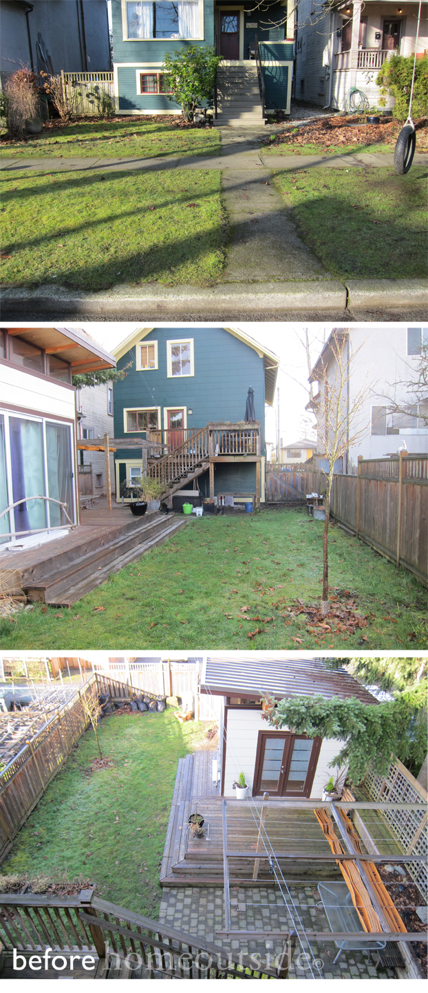
Andrea shared these ‘before’ photos of her narrow urban lot (just under 4,000 sq. ft.) and completed the Home Outside workbook with measurements of her property and information about her family’s hopes and preferences. Designer Jana Bryan came up with two designs that included spaces for growing fruit and vegetables, raising chickens, out-of-the-way storage, native plants for wildlife habitat, quiet contemplation, and relaxing with friends and family after a hard day’s work.
The Inspiration
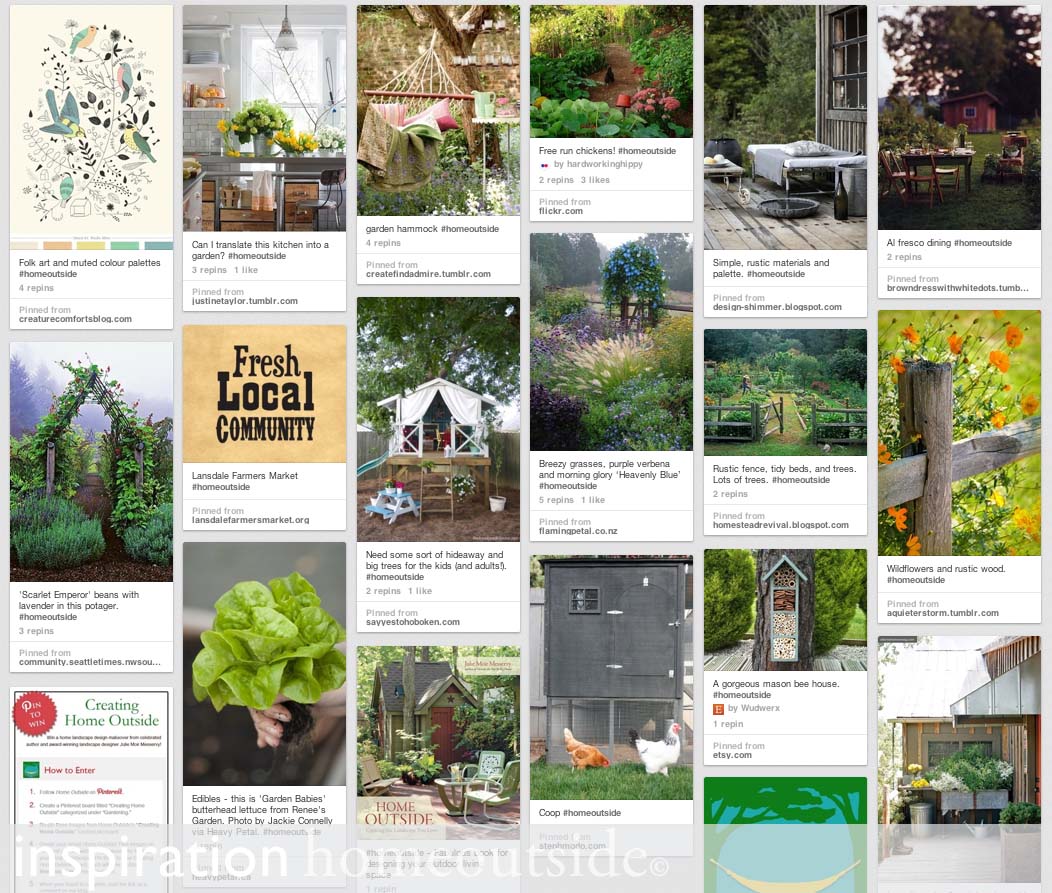
Here’s a screenshot of Andrea’s winning Pinterest board, which reveals her love of farmhouse aesthetics and rustic simplicity. Our design team thought it would be a lot of fun to create a miniature homestead on an urban property, and Jana used these images as inspiration for the details.
The Designs
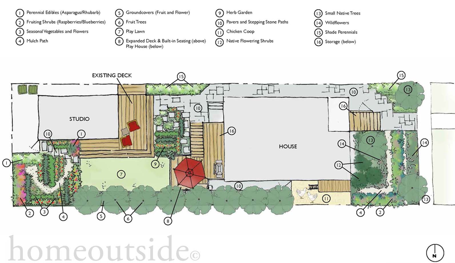
Design A (below) is the simplest to implement, maintaining a number of features from the existing design. There are edible plants in the front yard, an herb garden close to the back stairs, and a vegetable garden whose layout can be flexible from year to year. The upper deck is expanded, with shaded playspace underneath.
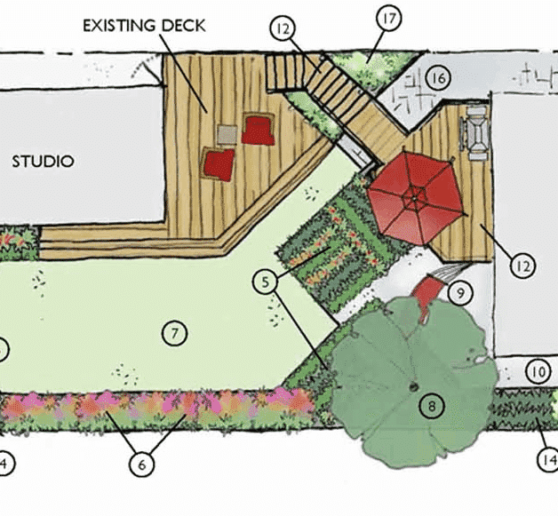
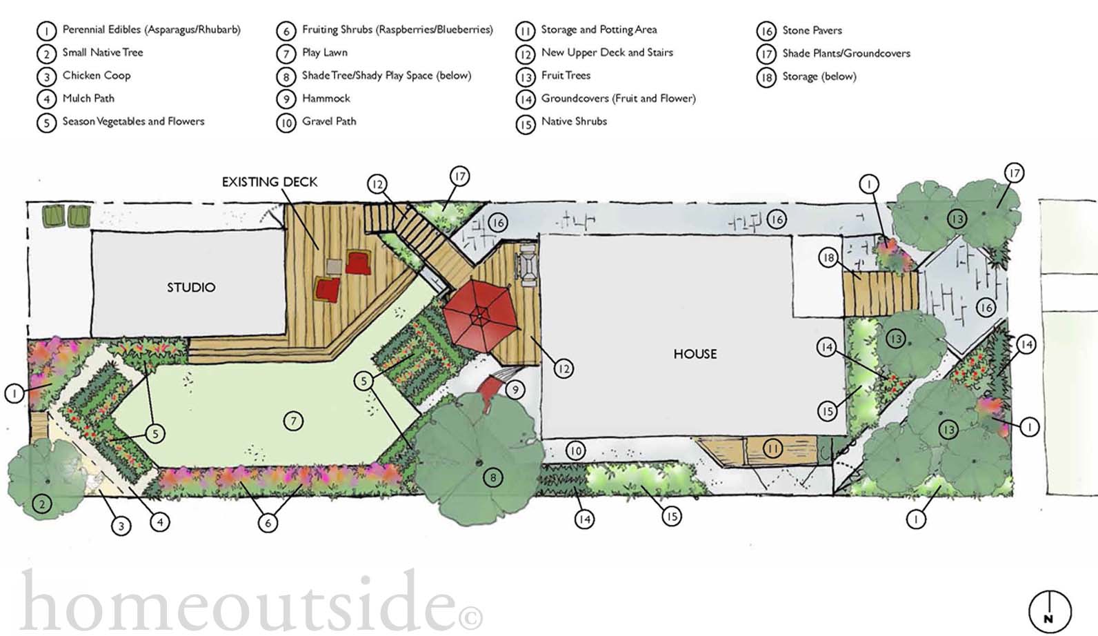
In her workbook, Andrea noted that her favorite aesthetic arrangement was “On the Angle,” which is featured in Design B (below), with front and back yard spaces arranged on an angle to the lines of the house and shed. The angular design is dynamic, energizing the small space and making it feel more expansive. The expanded upper deck connects directly to the existing lower deck via a flight of stairs which can serve as an arbor for fruiting vines.
So, which design will Andrea build?
She is choosing elements she likes from both designs. The final result will be closer to Design A, as it is simpler and less costly to create, but she will take details from Design B as well, such as the chicken coop in the back corner. We’ll share photos when we’ve got ’em!

